|
Last week, I took the time to add highlight covers to my Instagram page and LOVE the way they turned out. They add a streamlined, cohesive took to my page and it was so easy to do! I've been wanting to do this for awhile and am super glad I finally took the time to do it. Below, I'm sharing an article that inspired me to work on my Instagram Highlight covers. Along with great reasons why you should add highlight covers, the author also offers FREE art that will help brand your IG highlight covers! If you're not using Instagram Highlights yet, you need to be - and not just because it increases the lifespan of your stories. Ever since Instagram launched this new feature, I've watched bloggers, podcasters, and all sorts of online business owners experimenting with different ways to make them work for their brands. From a design and marketing standpoint, one of the best ways to take advantage of the feature is by editing the covers for each of your Highlights. Why use Highlights covers? Unless you specifically create and apply covers for your Highlights, Instagram will automatically select a random screen capture from one of your stories, which almost always ends up being a blurry, confusing blob. Even with a clear title, these automatic covers are just not pretty, and considering how easy it is to change them, I’m kinda shocked that the majority of the people I follow haven’t taken the opportunity to fancy up their profiles in this way. Editing the covers for each of your Highlights presents an opportunity to give your Instagram account a branded look and feel… So why not spend a few minutes and run with it? Brand your covers with icons If you already use icons on your website or in your brand collateral, you may as well save some time, keep it consistent, and take this approach. Keep in mind, you need to use icons that are really clear and super obvious with regards to what kind of content they’re highlighting. Even if you’ve written the name of the category below the icon, if people are confused about what it represents, they may just skip it. For example, if you're representing a podcast, you would be better off using an icon of a microphone than a set of headphones. Brand your covers with key words While covers with words in them are the obvious choice, this option won’t work unless you keep your keywords short and to the point. Since Highlight covers are so small, when you shrink the text down to a teeny tiny thumbnail, your seven-word sentence is going to look like a bunch of gibberish. If you do choose to take this route, you could get creative with the words you use to title your highlights. For example, if your Highlights cover says the word "beauty," you could title it with an emoji of lipstick instead of just re-writing the word "beauty" again. Tip: If you already have categories of content listed on your website or blog, that’s a good place to get inspiration, and source content for the stories inside of the Highlights. Repurpose your thumbnails You may already be in the habit of creating thumbnails for freebies on your website. If you are, you could take those thumbnails and use them to promote free content in your Highlights. Just share an Instagram story with the thumbnail in the graphic or screenshot, then zoom into it when you're adjusting the cover of your Highlight. 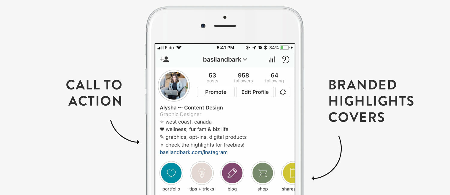 A few tips + tricks Here are a few things you may want to keep in mind before you create your covers: Keep it simple. Instagram Highlight covers are, of course, really small, so if you choose or create a cover image with a lot of detail, it’s all going to get lost once it’s applied to that little space on your profile. Choose or create icons that have very little detail, and go for sans-serif fonts that are clean, simple, and highly legible. Consider contrast. You need to choose colours and weights that contrast so the content on your cover will really stand out from the background – especially once it’s applied to your Highlight and super minimized. Stick to high-contrast colour pairings, and when it comes to type, only use medium or bold weights. What are your top five categories? Only the first five Highlights are immediately visible on your profile – you have to scroll to see the rest. While it’s fine to have more than five categories, consider which ones are going to take up that prime real estate, and act accordingly. Keep in mind that Instagram will put your latest Highlight categories at the front of the line, and (as of the time that I’m writing this post) there is no way to rearrange the Highlights on your profile.  *Link to original article below:
https://www.basilandbark.com/blog/how-to-brand-instagram-highlights-covers-three-ways#ck_modal Comments are closed.
|

Hi! Welcome to my blog space. This is where I share and repost inspirational and informative articles that I've found helpful when it comes to Design, Branding, Small Business, Social Media, Networking
& Print. I love to share information that has helped me and I know you will benefit from it as well! Enjoy!! Archives
Categories
All
|